The classification method chosen to display data affects the interpretation of the message presented on maps. It can dramatically influence perception and understanding. As a result, the map creator can manipulate and misrepresent the message presented out of ignorance but also malice. It would be highly unethical to manipulate the display of data on a map to intentionally mislead someone.
There are several ways to avoid misleading the audience by accident. It is imperative that the map author state the chosen classification method on the map. This way your audience knows immediately which classification method was used to represent the data keeping all intentions transparent. Furthermore, the map author could add a histogram to display the data distribution to avoid any accidental misrepresentation.
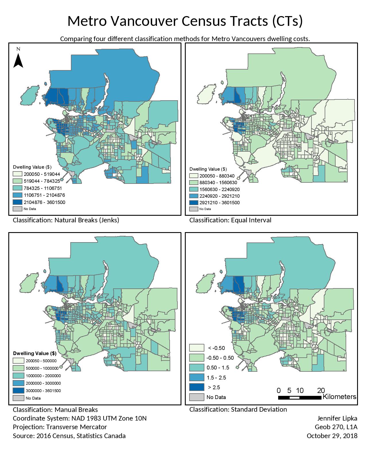
The below map, Figure 1, is an example of how using different classification methods on the same data can dramatically change the way the map looks and the message it portrays. In the Natural Breaks map, Metro Vancouver housing costs appear to be mid range to high with a few pockets of lower valued homes. In the next map displaying Equal Interval, Metro Vancouver appears to be dominated by lower valued homes with a few pockets of higher valued homes. Similarly, the map displaying Standard Deviation also gives the impression that homes in Metro Vancouver are lower than the average. Standard Deviation is a poor way to display this data as there is no meaningful point to compare the values to. To the bottom left, the Manual Breaks map uses a classification scheme that map readers would most likely understand efficiently and effectively.
Figure 1:
Within the census data used to create these maps, there were a number of Census Tract (CT) areas which were valued at ‘0’. This is the result of area and data suppression. These areas really represent ‘No Data’ rather than being a true value of ‘0’. Therefore, they need to be removed from the analysis. Data suppression is done to protect the identities of the people within a CT which is below a specific size. In the legend, you will notice that ‘No Data’ is represented as a grey colour.
There are 18 CTs with a value of ‘0’. The percentage of Metro Vancouver’s CTs which have a value of ‘0’ is 3.85%. Most of the areas overlap with a First Nations reserve. Houses on a First Nations reserve have complicated rules and may only be leased for 99 years. This would impact the median value of shelter costs and therefore, it is not included and shows a value of ‘0’. The Downtown Eastside (DTES) census data is incomplete and shows a number of ‘0’ values because not as many people in these areas are able to fill it out. Census data is mailed and many people who live in the DTES do not have registered addresses and may not be able to fill out the form.
The Median housing value is used because it is the middle value of the entire data set. In comparison, average is the value of all the variables added together and divided by the number of variables. It’s better to use median value for this analysis because average can be heavily skewed by outliers (either high or low). The median value will show you where the middle of all the values is excluding the influence of outliers.
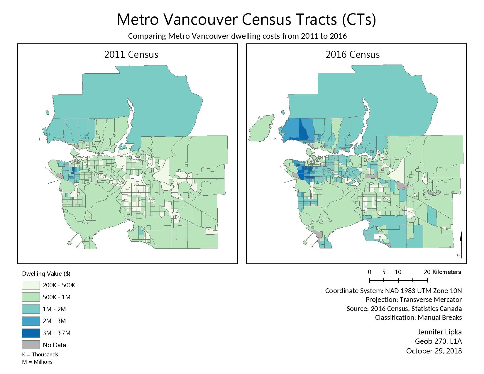
The below map, Figure 2, comparing housing costs in Metro Vancouver from 2011 and 2016 uses dwelling costs. In order to better assess affordability, you would use the ‘Shelter-cost-to-income ratio’ to compare different cities in Canada. The ‘Value (owner estimated) of private dwelling’ is not a great index of affordability because it doesn’t address the income of the residents. For example, even if the values of the homes are quite low, if the income level is not high enough, the city is still not affordable. If you want to discuss a comparison between the affordability of different cities across Canada, you should use ‘Shelter-cost-to-income ratio’ because this will show you the difference between not only housing values but it will also communicate the income differences of the residents. If you compare housing values in Vancouver and Calgary you may see that the homes in Vancouver are a lot more expensive than the homes in Calgary. However, it’s also important to note that the average income in Calgary is a lot higher than in Vancouver. So therefore, the affordability index is even better in Calgary because people make more and the houses cost less.
Figure 2:
Acquired, accessed and downloaded required spatial and tabular data
Gained practical GIS analytical skills such as joining tabular census data to spatial data using unique identifiers
Evaluated different classification methods for visualizing housing data
Gained insight into data science by investigating the difference between raw data and standardized data
Used spatial datasets to create a map that highlights the comparison of different classification methods and housing costs at different times